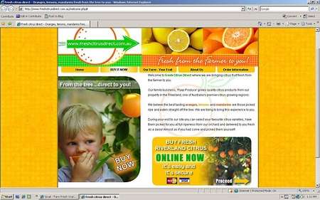
In web design, color is very important. The colors that would be chosen for a website will have a big impact on how that website would be perceived by the viewers. Color theorists were able to organize colors into a certain structure known as the color wheel, and this can be a very important basis in choosing the right colors for that website. In order to be able to select the right color combinations for the color wheel, one must have a good knowledge on how colors affect the viewers.
In the case of websites that have to deal with food – examples include websites for restaurants and food manufacturers, it should be noted that there are certain colors perfect for them to utilize. These certain colors are ideal simply because of their effect on the viewer. And what is that effect? They stimulate the viewers’ imaginations. This can be a great determining factor in web design. Here is a breakdown of the colors perfect for food-related websites.
Red
Red is one of the most common colors used for websites. It is a very strong color that appeals easily to the emotions. What is so great about red is that it is the strongest color when it comes to the appeal of appetite. Whenever people get a glimpse of the color red, they seem to feel the urge to eat. This can happen even if they are not really hungry at all. It is for this reason that it has been used by so many restaurants as their main color or one of their main colors in their website.
Yellow
Yellow is a color that is often attributed to brightness and happiness. It is also a strong color that can make any person feel hungry. It is no surprise that one of the most popular restaurants in all the world, uses yellow and red for their company colors. So it is guaranteed that a huge percentage of the people who visit that restaurant’s website would feel very hungry. A simple glance at the home page can easily cause him to want some big burgers and tasty fries.

Orange
Being a combination of red and yellow, orange can act as a great stimulant to the appetite. It is a color that promotes the idea of spontaneity, vitality, and vibrancy. It is a color that calls to action. Thus, it can be effectively used in web design. But in what way in particular? Well, there are a lot of urgent buyers out there in the Internet. They order food quickly once they feel to do so. The power of orange to call to action can be used to target such customers.
Green
Green is also a good color that can stimulate appetite. Thus, it is advisable for web designers to consider using green in their projects. Since there are so many shades of green, there should not be any surprise that the effect of the shades can vary in a great way. The best shade of green that stimulates the appetite is rich or vivid green. Green is perfect for restaurant websites that promote a healthy lifestyle or even for food manufacturer websites that sell fit and healthy products.
Of course, colors are not the only factors that make websites more appealing to the appetite. Web designers must also be good at designing website templates as well as choosing the right fonts. Also, there must be enough images of tasty dishes that would surely make the mouths of viewers go watery. If you want to have a food themed website that hits all the right buttons when it comes to website design, consider hiring our web designers at BA Consulting Inc.
